Colour Psychology Test Preparation
HSB
Hue (Temperature) - This is what we usually mean when we ask "what color is
that?" The property of color that we are actually asking about is "hue".
For example, when we talk about colours that are red, yellow, green, and blue, we are
talking about hue. Different hues are caused by different wavelengths of light. Therefore,
this aspect of color is usually easy to recognize.
Saturation (Chroma) - Color saturation refers to how vivid and intense a
color is. For example, a display with poor color saturation will look
washed out or faded. When a color's saturation level is reduced to 0,
it becomes a shade of gray.
Brightness (Value) - When we describe a colour as "light" or
"dark", we are discussing its "value" or "brightness". This property of
colour tells us how light or dark a color is based on how close it is to white. When colour is further from white it is referred to as a "shade" and when colours are closer to white they are referred to as "tint". For
instance, canary yellow would be considered lighter than navy blue which in turn is
lighter than black. Therefore, the value of canary yellow is higher than navy blue and
black.
"Value is the property of colour concerned with the amount of light a surface reflects or doesn't reflect. How light or dark the surface is"
Colour Psychology (6 Examples)
Red - Anger, Danger, Erotic, Heat, Love & Passion.
Black - Authority, Death, Evil, Mourning, Style & Power.
Blue - Cold, Freedom, Intelligence, Loyalty, Calming & Wisdom.
Green - Growth, Jealousy, Nature, Peace, Harmony & Comfort.
Purple - Beauty, Royalty, Wealth, Prosperity, Femininity & Rich.
Yellow - Cowardice, Energy, Happiness, Laughter, Optimism & Peace.
White - Purity, Cleanliness, Heaven, Marriage, Luxury & Creativity.
Orange - Friendly, Fun, Happiness, Warmth, Organic & Ambition.
Brown - Earth, Reliability, Stability, Friendship, Dirty & Disgusting.
Glossary of Colour terms
Analogous Colours - Harmonious colours which sit side by side on the colour wheel, related colours such as yellow, yellow orange, orange, orange red, red.
Chromaticity - Think about a color's "purity" when describing
its "chromaticity" or "chroma". This property
of color tells us how pure a hue is. That means there is no white, black, or gray present
in a color that has high chroma. These colors will appear very vivid and well, ... pure.
This concept is related to and often confused with saturation. However, we will continue
to use these terms separately because they refer to distinct situations, as explained
here.
 High
Chroma - very shiny, vivid
High
Chroma - very shiny, vivid
 Low
Chroma - achromatic, no hue
Low
Chroma - achromatic, no hue
 Constant
Chroma - medium chroma
Similar vividness despite differences in hue; less purity than top image.
Constant
Chroma - medium chroma
Similar vividness despite differences in hue; less purity than top image.
Colour Schemes - Plans for organising colours.
Complement - A colours complement is located directly opposite it on the colour wheel. Complementary colours create the strongest contrast of hue. They are exact opposites.
Cool Colours - Seem to move away from the viewer and include blue, green and violate.
Hue - This is what we usually mean when we ask "what color is
that?" The property of color that we are actually asking about is "hue".
For example, when we talk about colours that are red, yellow, green, and blue, we are
talking about hue. Different hues are caused by different wavelengths of light. Therefore,
this aspect of color is usually easy to recognise.
A pure hue is called a high-intensity colour in terms of brightness or dullness.
Hue
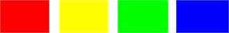
Contrast - strikingly different hues
 Hue
Constant - different colours, same hue (blue)
Hue
Constant - different colours, same hue (blue)
Pantone (13 Colours + Black & White, Single Run) -
Primary Colours - Primary colours are sets of colours that can be combined to make a useful range of colours. For human applications, three primary colours are usually used, since human color vision is trichromatic.
Quaternary Colours - Any colour that is made by mixing one primary colour (100% saturation) with any other primary colour that is at 25%, or 75% saturation. Quaternary colours include: Red, Cherry Red, Red-Orange, Orange-Yellow, Yellow-Green, Warm Green, Cool Green, Blue-Green, Blue, Ultramarine Blue, Purple-Mauve, and Red-Violet.
Saturation - Related to chromaticity, saturation tells us how a color
looks under certain lighting conditions. For instance, a room painted a solid color will
appear different at night than in daylight. Over the course of the day, although the color
is the same, the saturation changes. This property of color can also be called intensity.
Be careful not to think about saturation in terms of light and
dark but rather in terms of pale or weak and pure or strong.
Secondary Colours - A color resulting from the mixing of two primary colours
Ternary (Tertiary) - A tertiary color is a color made by mixing one primary color with one secondary color, in a given color space such as RGB or RYB.
 Saturation
Const. - same intensity, different hues
Saturation
Const. - same intensity, different hues
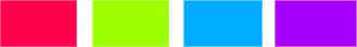
 Saturation
Contrast - various levels of fullness, same hue
Saturation
Contrast - various levels of fullness, same hue
Tints, Tones and Shades - These terms are often used inappropriately
but they describe fairly simple color concepts. The important thing to remember is how the
color varies from its original hue. If white is added to a color, the lighter version is
called a "tint". If the color is made darker by adding black, the result is
called a "shade". And if gray is added, each gradation gives you a different
"tone."
A "shade" is a colour with black added to it
A "tint" is any colour with white added to it
 Tints
(adding white to a pure hue)
Tints
(adding white to a pure hue)
 Shades
(adding black to a pure hue)
Shades
(adding black to a pure hue)
 Tones
(adding gray to a pure hue)
Tones
(adding gray to a pure hue)
Value - When we describe a color as "light" or
"dark", we are discussing its value or "brightness". This property of
color tells us how light or dark a color is based on how close it is to white. For
instance, canary yellow would be considered lighter than navy blue which in turn is
lighter than black. Therefore, the value of canary yellow is higher than navy blue and
black.
Value is the property of colour concerned with the amount of light a
surface reflects or doesn't reflect. How light or dark the surface is.
 Low
Value, Constant - same brightness level
Contrast
of Value - grayscale = no chroma
Low
Value, Constant - same brightness level
Contrast
of Value - grayscale = no chroma
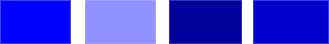
 Contrast
of Value - stark differences in brightness
Contrast
of Value - stark differences in brightness
Warm Colours - Ten to move toward the viewer and include red, orange and yellow
Colour Models
CMYK (Subtractive, Process Colour, Four Colour)
- C - Cyan
M - Majenta
Y - Yellow
K - Key (Black)
- Used for print. (300dpi - dots per inch)
- Ink is typically applied in order of abbreviation.
- 'Subtractive' colour model.
- CMYK works by masking colours on a ligher (white) background.
- The ink reduces the light that would otherwise be reflected.
- Hence 'subtractive' as ink's subtract brightness from white.
Pantone Colours - These are set colours easily found on a standard colour palette. By knowing the actual number of the pantone colour you want, designers and printers can perfectly match your art work to your desired end result.
RGB (Additive & Hexadecimal)
- R - Red
G - Green
B - Blue
- Used for screen. (72ppi - pixels per inch)
- Also used in photography.
- 'Additive' colour model.
- Colour is created by mixing light emitted by different coloured sources.
- Red, Green and Blue are emitted onto a Black screen.
- Hence 'added' together from these different sources.
.JPG)
.JPG)
.JPG)


.JPG)


